
Fortal
An independent, Fortaleza-inspired design system for Remix
Fortal is an application-owned design system built on Remix and Naked UI. Seven city-inspired paired themes, subtle neutral tints, flat controls, and shared token scales give apps a complete starting point without locking away the source.
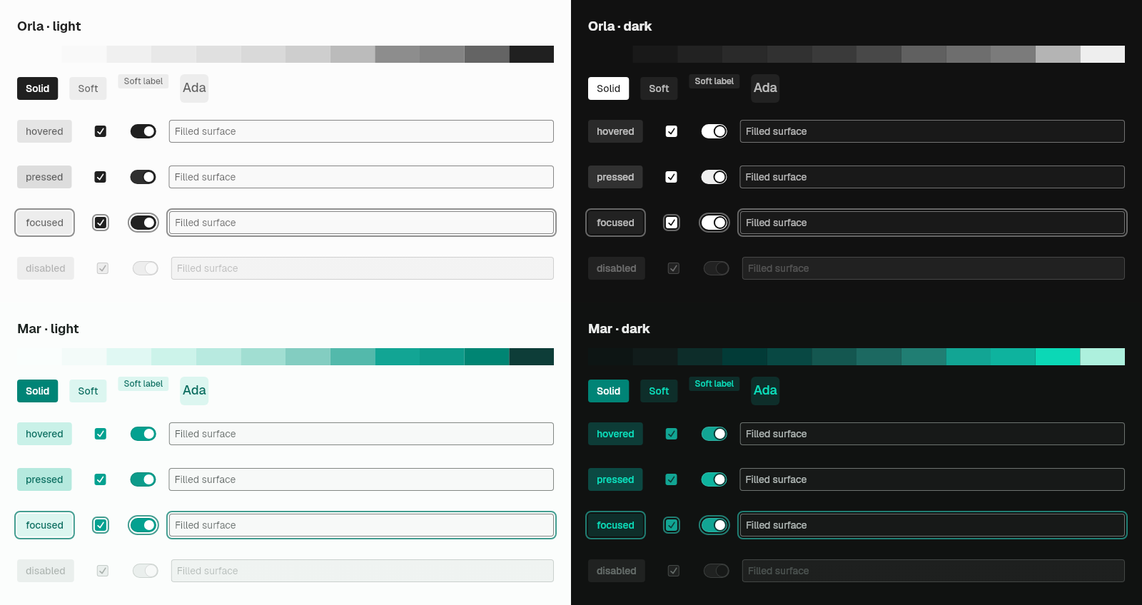
This overview covers installation and theming. Use the Catalog for widget sizes, variants, and defaults, or Typography for text styles. Live examples and their source live on the individual component pages.
Why a separate preset
Fortal lives in its own application-owned preset so that remix stays a
genuinely theme-free component library. If you are building your own design
system on Remix, you pay nothing for a theme you never use. If you choose
Fortal, the CLI copies its token tables, paired color scales, source license, and recipes into your
application, where they become your source.
The repository keeps registry_source (lib/src/fortal) as the analyzed authoring and
Fortal specification and test surface. Consumer applications do not depend on that package.
Installation
The commands below apply after the first CLI release and Remix beta.11. For checkout use, follow the Open Code installation instructions.
flutter pub add dev:remix_cli
dart run remix_cli:remix init --prefix Fortal --preset fortal
dart run remix_cli:remix add button
The Fortal prefix keeps the API names shown throughout this guide. Add each
additional item when you use it, and import your installed lib/ui/ui.dart
barrel from application code.
Quick Start
Wrap your app with FortalTheme to provide the design tokens, then use the
Fortal* widgets. Named constructors select a fixed variant; use the unnamed
constructor with variant: when the choice is dynamic:
import 'package:flutter/material.dart';
import 'ui/ui.dart';

class MyApp extends StatelessWidget {
  @override
  Widget build(BuildContext context) {
    return FortalTheme(
      child: WidgetsApp(
        color: Colors.white,
        builder: (_, _) => Center(
          child: FortalButton.solid(
            onPressed: () {},
            label: 'Fortal Button',
          ),
        ),
      ),
    );
  }
}
FortalTheme is a MixScope, so it satisfies the theme-scope row of Remix's
host capabilities table. Place it above your app widget so
that overlay and route content inherits the tokens.
Scope placement
The outermost FortalTheme provides design tokens and sets default text and icon
styles for standard Flutter widgets (DefaultTextStyle and IconTheme using
gray12). Unstyled Text widgets receive the text3 size (16px, 1.5 line
height) in regular weight with gray12. Fortal components (FortalText,
FortalCode, FortalKbd, and FortalLink) resolve their styling directly from
active theme tokens instead.
A nested scope updates design tokens for its subtree. When the nested scope
changes brightness, it updates DefaultTextStyle and IconTheme to
the new gray12 color while preserving existing font metrics.
Each scope installs a complete token set instead of merging with the scope above
it. A token override made with MixScope.inherit, such as a custom
focusRingWidth, reaches only the widgets between it and the next FortalTheme
below. That nested FortalTheme restores the theme's own values, so place the
override inside the nested scope.
Use WidgetsApp for the application host. For an application with routes, put
FortalTheme in builder, above the Navigator, so pushed routes and dialogs
inherit the same tokens and text style:
import 'package:flutter/widgets.dart';
import 'ui/ui.dart';

class MyApp extends StatelessWidget {
  const MyApp({super.key});

  @override
  Widget build(BuildContext context) {
    return WidgetsApp(
      color: const Color(0xFFF8FAFC),
      pageRouteBuilder: <T>(settings, builder) => PageRouteBuilder<T>(
          settings: settings,
          pageBuilder: (context, animation, secondaryAnimation) => builder(context),
        ),
      builder: (context, child) => FortalTheme(child: child!),
      home: const Center(child: FortalText('Themed')),
    );
  }
}
For app-wide toasts, wrap the Navigator in Overlay.wrap and
RemixToastScope inside this builder, below FortalTheme. See the
toast scope example.
The root run is only a fallback for bare Flutter Text, and it follows
Flutter's normal text-style cascade. A nearer DefaultTextStyle, including one
installed by Material or Scaffold, wins for that bare text. Fortal
typography does not inherit it: omitted sizes use the text3 token, and an
explicit size: selects another token size. Transparent, non-accent
FortalCode.ghost is the deliberate exception for foreground only, so it can
blend into surrounding text without inheriting that run's metrics.
Nested themes retain the surrounding text metrics. When the paired neutral changes, bare text and icons use the new theme's neutral foreground.
If an overlay's text does not inherit your theme, ensure the theme scope wraps the Navigator or Overlay that owns the entry. A scope inside one route cannot theme entries inserted above that route.
Light, dark, and system appearance
FortalTheme supplies light and dark preset defaults and follows the system at
the root. Nested scopes inherit the configured pair and active selection.
Customize the pair with theme and darkTheme, or force mode to .light or
.dark. mode: .system follows live platform brightness changes.
import 'package:flutter/widgets.dart';
import 'ui/ui.dart';

Widget withAppearance(Widget child) => FortalTheme(
  theme: const FortalThemeConfig(
    accent: FortalAccentColor.orla,
    brightness: Brightness.light,
  ),
  darkTheme: const FortalThemeConfig(
    accent: FortalAccentColor.orla,
    brightness: Brightness.dark,
  ),
  mode: FortalThemeMode.system,
  child: child,
);
Supplying only theme makes it the fallback for both modes. Supplying only
darkTheme retains the default or inherited base theme. Direct scope options
such as accent apply to both appearances. Appearance selection uses mode;
the scope no longer accepts a brightness parameter.
For routed WidgetsApp examples, wrap the Navigator with the scope in builder.
A default WidgetsApp also preserves the text defaults of a scope above it. An
explicit WidgetsApp textStyle overrides those outer defaults; a scope inside
the builder establishes its defaults below the app’s text style.
Installed Fortal source uses your prefix: AcmeTheme, AcmeThemeData, and
AcmeThemeMode expose the same behavior. No Material application host is needed.
Customizing Fortal Styles
Fortal widgets call the matching fortal*Style recipe internally. Use those
recipes directly when you need a custom Remix widget composition:
import 'package:flutter/material.dart';
import 'ui/ui.dart';

final style = fortalButtonStyle(variant: FortalButtonVariant.solid)
  .borderRadius(.all(const Radius.circular(8)))
  .padding(.horizontal(32))
  .onHovered(.scale(1.05));
Fortal Design Tokens
Fortal styles are built on a robust token system that includes:
- Colors: 12-step Radix accent and gray scales, paired under seven Fortal theme names
- Spacing: 9-step spacing scale
- Border Radius: 6-step radius scale
- Shadows: 6-level shadow system
- Typography: 9-size type scale
- Border Widths: Consistent stroke weights
You can use these tokens directly in your custom styles:
import 'package:remix/remix.dart';
import 'ui/ui.dart';

final style = ButtonStyler()
  .color(FortalTokens.accentSolid())
  .padding(.all(FortalTokens.space4()))
  .borderRadius(.all(FortalTokens.radius3()))
  .label(TextStyler().color(FortalTokens.accentContrast()));
Typography
Fortal adds five typography families that base Remix has no counterpart for:
FortalText, FortalHeading, FortalCode, FortalKbd, and FortalLink. They
share one nine-step FortalTextSize scale and one FortalTextWeight enum. See
Typography for widget selection, controls, semantics,
recipe customization, and composition guidance.
Charts
Fortal provides themed line, bar, and pie recipes backed by mix_chart. Install
the owned chart recipe through the same configured preset:
dart run remix_cli:remix add chartimport 'package:mix_chart/mix_chart.dart';
import 'ui/ui.dart';
final chart = FortalLineChart(
semanticsLabel: 'Weekly revenue',
series: [
LineSeries(
id: 'revenue',
label: 'Revenue',
points: [
ChartPoint(id: 'mon', x: 0, y: 18),
ChartPoint(id: 'tue', x: 1, y: 31),
],
),
],
);Use FortalLineChart, FortalBarChart, and FortalPieChart for the ready-made
widgets. Their matching fortal*ChartStyle() recipes can style the underlying
mix_chart widgets directly.
Icons
Install the optional application-owned icon aliases through the configured preset:
dart run remix_cli:remix add iconsThat item adds remix_ui_icons and creates FortalIcons with the small alias
set used by your UI layer. Add, rename, or remove those aliases as the
application vocabulary evolves. The aliases point at Remix's Vector UI glyphs.
Import package:remix_ui_icons/remix_ui_icons.dart and use RemixIcons
directly for the rest of the pack: 77 Outline concepts, each in outline and
filled styles at native 24, 16, and 12 px masters (search, searchFilled16),
plus the Rounded family as RoundedIcons.
Catalogs, galleries, and drift tests that must enumerate every glyph can import the opt-in index. An application that never imports it keeps full font subsetting:
import 'package:remix_ui_icons/icons_index.dart';

final search = remixIconEntries.firstWhere((entry) => entry.name == 'search');
Seven paired themes
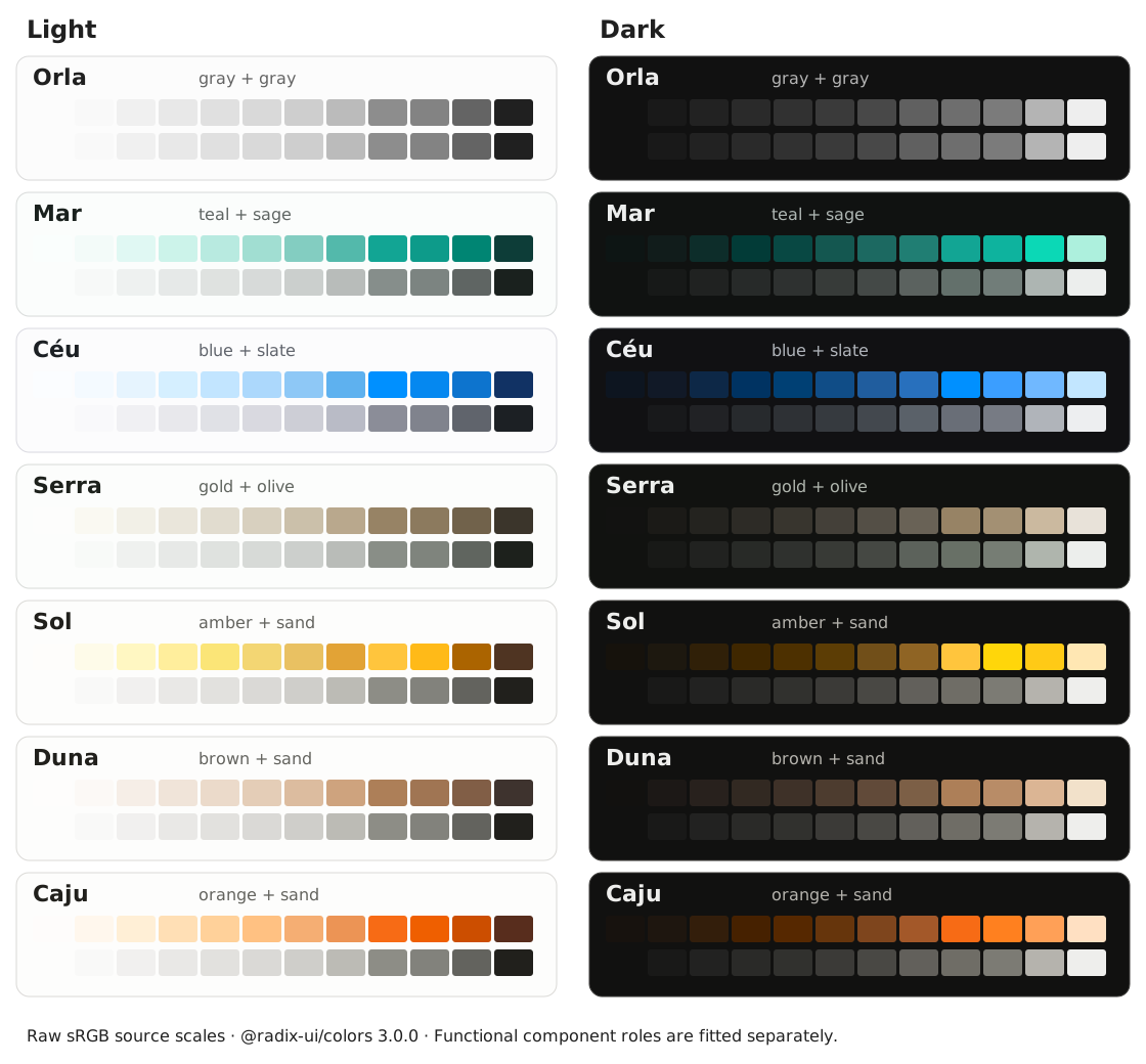
Choose one Fortal theme. Its accent and subtly tinted gray are selected together; there is no separate neutral picker. The default is Orla. Both appearances use real scales from Radix Colors, pinned to version 3.0.0. Fortal keeps its own component geometry and accessibility requirements.
| Theme | Dart value | Radix accent | Paired neutral |
|---|---|---|---|
| Orla | orla | Gray | Gray |
| Mar | mar | Teal | Sage |
| Céu | ceu | Blue | Slate |
| Serra | serra | Gold | Olive |
| Sol | sol | Amber | Sand |
| Duna | duna | Brown | Sand |
| Caju | caju | Orange | Sand |
import 'package:flutter/widgets.dart';
import 'ui/ui.dart';

Widget themedApp(Widget child) => FortalTheme(
  accent: .mar,
  mode: .system,
  child: child,
);
The existing accent option selects the whole named combination. Page backgrounds,
cards, text and borders use its paired gray. Buttons, badges, avatars, selections
and progress use the accent. Neutral scale names such as Sage and Slate are
internal source names; users choose only the seven Fortal themes.
Migrating an existing theme
Remove gray: from FortalTheme, FortalThemeConfig and FortalThemeData, and
remove grayColor from dashboard theme settings. FortalGrayColor is removed.
The selected theme now owns the gray pairing. Existing accent: choices and
ASCII identifiers, including ceu, remain supported. calcadao remains a
deprecated alias for the Orla accent and palette constant. Migrate stored
calcadao names to orla.
This update changes palette values. In particular, Serra now uses muted Gold with Olive neutrals, and Duna uses Brown with Sand neutrals. The swatches above show the actual source scales, not generated approximations of the former seeds.
Contrast and functional colors
Raw source steps remain unchanged. Use functional roles in component styles:
accentSolid/accentSolidHoverwithaccentContrastfor labelled fills.accentContent/accentContentAlphafor normal colored text on soft fills.accentIndicator/accentTrackwithaccentIndicatorContrastfor marks; useaccentMarkHoverfor their hover or pressed fill.focus8andcontrolBorderfor visible focus and empty-control boundaries.
Fortal fits these roles where the source swatch alone cannot retain its existing
WCAG requirements: 4.5:1 for normal labels and soft text, 3:1 for marks,
focus and control cues. Sol keeps warm-brown labels. Orla uses dark primary
fills with white labels in light mode, and white primary fills with dark labels
in dark mode; its selected controls follow the same contrast. Its panels, soft
treatments and secondary text retain their gray hierarchy. The other named
themes use white labels on appropriately fitted solid fills. High-contrast variants remain
available; in dark mode Orla’s explicit high-contrast fill uses source Gray-12
(#EEEEEE), slightly dimmer than its default white. These are Fortal role choices,
while the chart above shows unchanged raw Radix scales. Functional fills can
therefore differ from the raw step-9 swatch.
Error tokens use the dedicated red fortalError, independently of the selected
theme. Keep a text label or icon alongside status colors. Raw opaque/alpha scales
are imported together; alpha colors follow normal source-over compositing on
the host surface.
Panels default to solid, with zero blur. panelBackground: .translucent is
opt-in. Only floating layers carry elevation; cards and controls remain flat.
Radius, scaling, appearance, font selection and icons remain independent options.
Your own brand seed
Custom brand generation remains available alongside the pinned built-in themes.
From a Remix checkout, generate a palette next to the installed palette.dart:
fvm dart run registry_source/tool/fortal_palettes/generate.dart \
  --name brand --seed '#8038CC' --type-prefix Fortal \
  --output /path/to/app/lib/ui/theme/brand_colors.dart
Set --type-prefix to the prefix in the app's remix.yaml (for example,
Acme). The default is Fortal. --palette-import changes the sibling import
when the file lives elsewhere. Import the generated file in the app and pass
accentPalette: brand to its theme. A custom palette supplies both modes and
inherits through nested scopes; an explicit named accent in a nested scope
selects that built-in palette again.
Very light custom accents
A near-white seed can blend with the page while retaining readable labels.
Use a control's highContrast: true treatment or an explicit step-8 border
when a visible boundary matters. See the
owned custom-palette policy
for the guarantees, limits, and near-white measurements.
Owned specification and review
The catalog is generated from Fortal's own machine-readable specification, checked against its source APIs and test inventory in CI. The prose specification owns tokens, defaults, geometry, variants, and contrast targets.
The Fortal playground in apps/demo includes a polish board with every family,
every size and variant, side-by-side light/dark panels, palette selection,
a 4px grid, and hover/pressed/focus/disabled review states:
cd apps/demo
fvm flutter run -d chrome -t lib/polish_main.dart
Owned golden tests capture the board and all seven palette/state combinations.
For usage examples, see the Fortal widgets section on each
component page.