Building a Design System Widget
This tutorial walks through creating a design system button with Mix, demonstrating Specs, Stylers, variants, and state handling — using annotations and code generation to eliminate boilerplate.
Prerequisites
Before starting, make sure you have:
- A Flutter project with
mixadded as a dependency mix_annotationsin yourdependenciesmix_generatorandbuild_runnerin yourdev_dependencies- Familiarity with basic Mix concepts (
BoxStyler,Style,Spec)
dependencies:
  mix: ^2.0.0
  mix_annotations: ^2.0.0

dev_dependencies:
  mix_generator: ^2.0.0
  build_runner: ^2.4.0
Component Overview
Button Variants
- Filled: Solid background color
- Outline: Transparent background with visible border
- Elevated: Shadow effect for raised appearance
- Link: Looks like a clickable link, no background
Button States
- Normal: Default state
- Hover: Mouse over or keyboard focus
- Pressed: Actively being pressed
- Disabled: Non-interactive
Button Structure
- Container: Box decoration (border radius, background color, spacing)
- Icon (optional): Visual embellishment
- Label: Text content
Step 1: Define the Button Spec
A Spec defines resolved visual properties. With @MixableSpec(), the generator creates copyWith(), lerp(), debugFillProperties(), and props for you:
import 'package:flutter/foundation.dart';
import 'package:flutter/material.dart';
import 'package:mix/mix.dart';
import 'package:mix_annotations/mix_annotations.dart';

part 'button_spec.g.dart';

@MixableSpec()
@immutable
final class ButtonSpec extends Spec<ButtonSpec>
    with Diagnosticable, _$ButtonSpecMethods {
  @override
  final StyleSpec<FlexBoxSpec>? container;
  @override
  final StyleSpec<IconSpec>? icon;
  @override
  final StyleSpec<TextSpec>? label;

  const ButtonSpec({this.container, this.icon, this.label});
}
That’s it — no manual copyWith, lerp, or props. The generated mixin _$ButtonSpecMethods provides all of those.
Run code generation now before proceeding to the next step:
dart run build_runner buildGenerated code (button_spec.g.dart) — key signatures
button_spec.g.dart) — key signatures// GENERATED CODE - DO NOT MODIFY BY HAND
part of 'button_spec.dart';
mixin _$ButtonSpecMethods on Spec<ButtonSpec>, Diagnosticable {
@override
ButtonSpec copyWith({StyleSpec<FlexBoxSpec>? container, ...}) { ... }
@override
ButtonSpec lerp(ButtonSpec? other, double t) { ... }
@override
void debugFillProperties(DiagnosticPropertiesBuilder properties) { ... }
@override
List<Object?> get props => [container, icon, label];
}Step 2: Create the Button Styler
ButtonStyler provides a fluent interface for styling. With @MixableStyler(), the generator creates setters, merge(), resolve(), debugFillProperties(), and props.
Declaring Styler Fields
Use @MixableField(setterType: ...) to tell the generator the public type for each setter. Internally, fields are Prop<StyleSpec<T>>, but users pass Styler types — setterType bridges that gap:
part 'button_style.g.dart';

@MixableStyler()
class ButtonStyler extends MixStyler<ButtonStyler, ButtonSpec>
    with _$ButtonStylerMixin {
  @override
  @MixableField(setterType: FlexBoxStyler)
  final Prop<StyleSpec<FlexBoxSpec>>? $container;
  @override
  @MixableField(setterType: IconStyler)
  final Prop<StyleSpec<IconSpec>>? $icon;
  @override
  @MixableField(setterType: TextStyler)
  final Prop<StyleSpec<TextSpec>>? $label;
The @MixableField(setterType: FlexBoxStyler) annotation tells the generator to produce ButtonStyler container(FlexBoxStyler value) instead of ButtonStyler container(StyleSpec<FlexBoxSpec> value). This gives users the fluent Styler API they expect.
Constructors
The primary constructor accepts Styler types and wraps them with Prop.maybeMix(), which converts a nullable Styler into the internal Prop<StyleSpec<T>> representation. The .create constructor accepts raw Prop values for advanced use:
  ButtonStyler({
    FlexBoxStyler? container,
    IconStyler? icon,
    TextStyler? label,
    super.animation,
    super.modifier,
    super.variants,
  }) : $container = Prop.maybeMix(container),
       $icon = Prop.maybeMix(icon),
       $label = Prop.maybeMix(label);

  const ButtonStyler.create({
    Prop<StyleSpec<FlexBoxSpec>>? container,
    Prop<StyleSpec<IconSpec>>? icon,
    Prop<StyleSpec<TextSpec>>? label,
    super.animation,
    super.modifier,
    super.variants,
  }) : $container = container,
       $icon = icon,
       $label = label;
Convenience Methods
Beyond the generated container(), icon(), and label() setters, you can add domain-specific convenience methods. Each one calls merge() to layer the new style on top of the existing one:
  ButtonStyler backgroundColor(Color value) {
    return merge(ButtonStyler(container: FlexBoxStyler.color(value)));
  }

  ButtonStyler textColor(Color value) {
    return merge(ButtonStyler(label: TextStyler.color(value)));
  }

  ButtonStyler iconColor(Color value) {
    return merge(ButtonStyler(icon: IconStyler.color(value)));
  }

  ButtonStyler borderRadius(double value) {
    return merge(
      ButtonStyler(
        container: FlexBoxStyler().borderRadius(.circular(value)),
      ),
    );
  }

  ButtonStyler padding({required double x, required double y}) {
    return merge(
      ButtonStyler(
        container: FlexBoxStyler().padding(.horizontal(x).vertical(y)),
      ),
    );
  }

  ButtonStyler scale(double value) {
    return merge(ButtonStyler(container: FlexBoxStyler().scale(value)));
  }
}
MixStyler already provides WidgetStateVariantMixin (for onPressed, onHovered, onDisabled, etc.), VariantStyleMixin, and AnimationStyleMixin — so you get state handling for free.
Run dart run build_runner build again to generate the Styler mixin.
Generated code (button_style.g.dart) — key signatures
button_style.g.dart) — key signatures// GENERATED CODE - DO NOT MODIFY BY HAND
part of 'button_style.dart';
mixin _$ButtonStylerMixin on Style<ButtonSpec>, Diagnosticable {
// Setters generated from @MixableField(setterType:)
ButtonStyler container(FlexBoxStyler value) { ... }
ButtonStyler icon(IconStyler value) { ... }
ButtonStyler label(TextStyler value) { ... }
// Base methods from MixStyler
ButtonStyler animate(AnimationConfig value) { ... }
ButtonStyler variants(List<VariantStyle<ButtonSpec>> value) { ... }
ButtonStyler wrap(WidgetModifierConfig value) { ... }
@override
ButtonStyler merge(ButtonStyler? other) { ... }
@override
StyleSpec<ButtonSpec> resolve(BuildContext context) { ... }
@override
void debugFillProperties(DiagnosticPropertiesBuilder properties) { ... }
@override
List<Object?> get props =>
[$container, $icon, $label, $animation, $modifier, $variants];
}Step 3: Define Variants
Use an enum to associate each visual variant with its style overrides:
enum ButtonVariant {
  filled,
  outlined,
  elevated,
  link;

  ButtonStyler get style {
    switch (this) {
      case ButtonVariant.filled:
        return ButtonStyler()
            .backgroundColor(Colors.blueAccent)
            .textColor(Colors.white)
            .iconColor(Colors.white);

      case ButtonVariant.outlined:
        return ButtonStyler()
            .container(
              FlexBoxStyler()
                  .color(Colors.transparent)
                  .border(.color(Colors.blueAccent).width(1.5)),
            )
            .textColor(Colors.blueAccent)
            .iconColor(Colors.blueAccent);

      case ButtonVariant.elevated:
        return ButtonStyler()
            .backgroundColor(Colors.blueAccent)
            .textColor(Colors.white)
            .iconColor(Colors.white)
            .container(
              FlexBoxStyler().shadow(
                BoxShadowMix()
                    .color(Colors.blueAccent.shade700)
                    .offset(x: 0, y: 5),
              ),
            );

      case ButtonVariant.link:
        return ButtonStyler()
            .container(
              FlexBoxStyler()
                  .border(.style(.none))
                  .color(Colors.transparent),
            )
            .textColor(Colors.blueAccent)
            .iconColor(Colors.blueAccent);
    }
  }
}
Step 4: Style the Button
The buttonStyle function composes everything: base styles shared across all variants, variant-specific overrides, and state handling for pressed and disabled:
ButtonStyler buttonStyle(ButtonStyler? style, ButtonVariant? variant) {
  final container = FlexBoxStyler()
      .borderRadius(.circular(6))
      .padding(.horizontal(8).vertical(12))
      .spacing(8)
      .mainAxisAlignment(.center)
      .crossAxisAlignment(.center)
      .mainAxisSize(.min);

  final label = TextStyler().style(
    TextStyleMix().fontSize(16).fontWeight(.w500),
  );

  final icon = IconStyler().size(18);

  return ButtonStyler()
      .container(container)
      .label(label)
      .icon(icon)
      .merge(variant?.style)
      .onPressed(
        ButtonStyler()
            .container(FlexBoxStyler().scale(0.9)),
      )
      .onDisabled(
        ButtonStyler()
            .container(FlexBoxStyler().color(Colors.blueGrey.shade100))
            .label(
              TextStyler().style(
                TextStyleMix().color(Colors.blueGrey.shade700),
              ),
            )
            .icon(IconStyler().color(Colors.blueGrey.shade700)),
      )
      .merge(style);
}
Notice the merge order: base styles first, then variant overrides, then state styles, and finally any caller-provided style override on top. This lets consumers customize any button instance without forking the style function.
Step 5: Build the Widget
CustomButton uses Pressable for interaction states and StyleBuilder to resolve styles:
class CustomButton extends StatelessWidget {
  const CustomButton({
    super.key,
    required this.label,
    this.disabled = false,
    this.icon,
    required this.onPressed,
    this.variant = ButtonVariant.filled,
    this.style,
  });

  final String label;
  final bool disabled;
  final IconData? icon;
  final ButtonVariant variant;
  final VoidCallback? onPressed;
  final ButtonStyler? style;

  @override
  Widget build(BuildContext context) {
    return Pressable(
      onPress: disabled ? null : onPressed,
      enabled: !disabled,
      child: StyleBuilder(
        style: buttonStyle(style, variant),
        builder: (context, spec) {
          return FlexBox(
            styleSpec: spec.container,
            children: [
              if (icon != null) StyledIcon(icon: icon, styleSpec: spec.icon),
              if (label.isNotEmpty) StyledText(label, styleSpec: spec.label),
            ],
          );
        },
      ),
    );
  }
}
Variant Convenience Widgets
Create shorthand widgets for each variant. These extend CustomButton and lock in the variant:
Note: These names (
FilledButton,OutlinedButton,ElevatedButton) shadow Flutter’s built-in Material button widgets. In a real project, use a prefix to avoid import conflicts (e.g.,MixFilledButton, or your design system’s namespace).
final class FilledButton extends CustomButton {
  const FilledButton({
    super.key,
    required super.label,
    super.disabled = false,
    super.icon,
    required super.onPressed,
    super.style,
  }) : super(variant: ButtonVariant.filled);
}

final class OutlinedButton extends CustomButton {
  const OutlinedButton({
    super.key,
    required super.label,
    super.disabled = false,
    super.icon,
    required super.onPressed,
    super.style,
  }) : super(variant: ButtonVariant.outlined);
}

final class ElevatedButton extends CustomButton {
  const ElevatedButton({
    super.key,
    required super.label,
    super.disabled = false,
    super.icon,
    required super.onPressed,
    super.style,
  }) : super(variant: ButtonVariant.elevated);
}

final class LinkButton extends CustomButton {
  const LinkButton({
    super.key,
    required super.label,
    super.disabled = false,
    super.icon,
    required super.onPressed,
    super.style,
  }) : super(variant: ButtonVariant.link);
}
Results
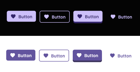
Full example app
void main() {
  runApp(const MyApp());
}

class MyApp extends StatelessWidget {
  const MyApp({super.key});

  @override
  Widget build(BuildContext context) {
    return const MaterialApp(
      home: ButtonExampleScreen(),
    );
  }
}

class ButtonExampleScreen extends StatelessWidget {
  const ButtonExampleScreen({super.key});

  @override
  Widget build(BuildContext context) {
    final icon = Icons.favorite;

    return Scaffold(
      appBar: AppBar(
        title: const Text('Button Examples'),
      ),
      body: Padding(
        padding: const EdgeInsets.all(16.0),
        child: Column(
          mainAxisAlignment: MainAxisAlignment.center,
          crossAxisAlignment: CrossAxisAlignment.stretch,
          children: [
            FilledButton(
              label: 'Filled Button',
              icon: icon,
              onPressed: () {},
            ),
            const SizedBox(height: 10),
            OutlinedButton(
              label: 'Outlined Button',
              icon: icon,
              onPressed: () {},
            ),
            const SizedBox(height: 10),
            ElevatedButton(
              label: 'Elevated Button',
              icon: icon,
              onPressed: () {},
            ),
            const SizedBox(height: 10),
            LinkButton(
              label: 'Link Button',
              icon: icon,
              onPressed: () {},
            ),
            const SizedBox(height: 20),
            const Text(
              'Disabled State:',
              style: TextStyle(fontSize: 18, fontWeight: FontWeight.bold),
            ),
            const SizedBox(height: 10),
            FilledButton(
              label: 'Disabled Button',
              icon: icon,
              disabled: true,
              onPressed: () {},
            ),
          ],
        ),
      ),
    );
  }
}
Summary
This tutorial covered:
@MixableSpec: GeneratescopyWith(),lerp(),debugFillProperties(), andprops— no manual boilerplate@MixableStyler: Generates setters,merge(),resolve(),debugFillProperties(), andprops— you only write convenience methods@MixableField(setterType:): Controls the public type of generated setters (e.g., acceptFlexBoxStylerinstead ofStyleSpec<FlexBoxSpec>)MixStyler: Base class that providesWidgetStateVariantMixin,VariantStyleMixin, andAnimationStyleMixinfor free- ButtonVariant: Enum associating variants with styles
- CustomButton: Widget combining
PressableandStyleBuilder
What you write vs. what’s generated
| You write | Generator provides |
|---|---|
| Spec fields and constructor | copyWith(), lerp(), debugFillProperties(), props |
| Styler fields, constructors, convenience methods | Setters (via @MixableField), merge(), resolve(), debugFillProperties(), props |
This pattern extends to other components: cards, inputs, dialogs, etc.
Next Steps
- Advanced Widget State Control — programmatic state control, custom states, and
StyleBuilder - Theming — apply consistent tokens across your design system
- Creating Context Variants — conditionally apply styles based on runtime context
- Animations — add implicit, phase, and keyframe animations to your components